Behind the Scenes
Building My Portfolio Website
Overview
Introduction
Building a personal website is more than just coding; it’s about crafting an experience that reflects who you are. In this detailed breakdown, I’ve segmented the content into digestible sections, each focusing on a different aspect of the project, from initial ideation to how this website came to life.
So if you are interested in sharing my thought process, design decisions, and architectural choices, you have found the right place.
Research and Ideation
The first step in my process was research. I explored other people’s portfolios to gather inspiration, taking note of elements I liked and disliked. More importantly, I reflected on why I felt a certain way about these elements. Often, it wasn’t the concept itself that I disliked, but how it was presented. This exercise helped me rationalize my preferences and define clear design principles for my own project.
Armed with this insight, I started from the basics: a notebook and a multicolor pen.
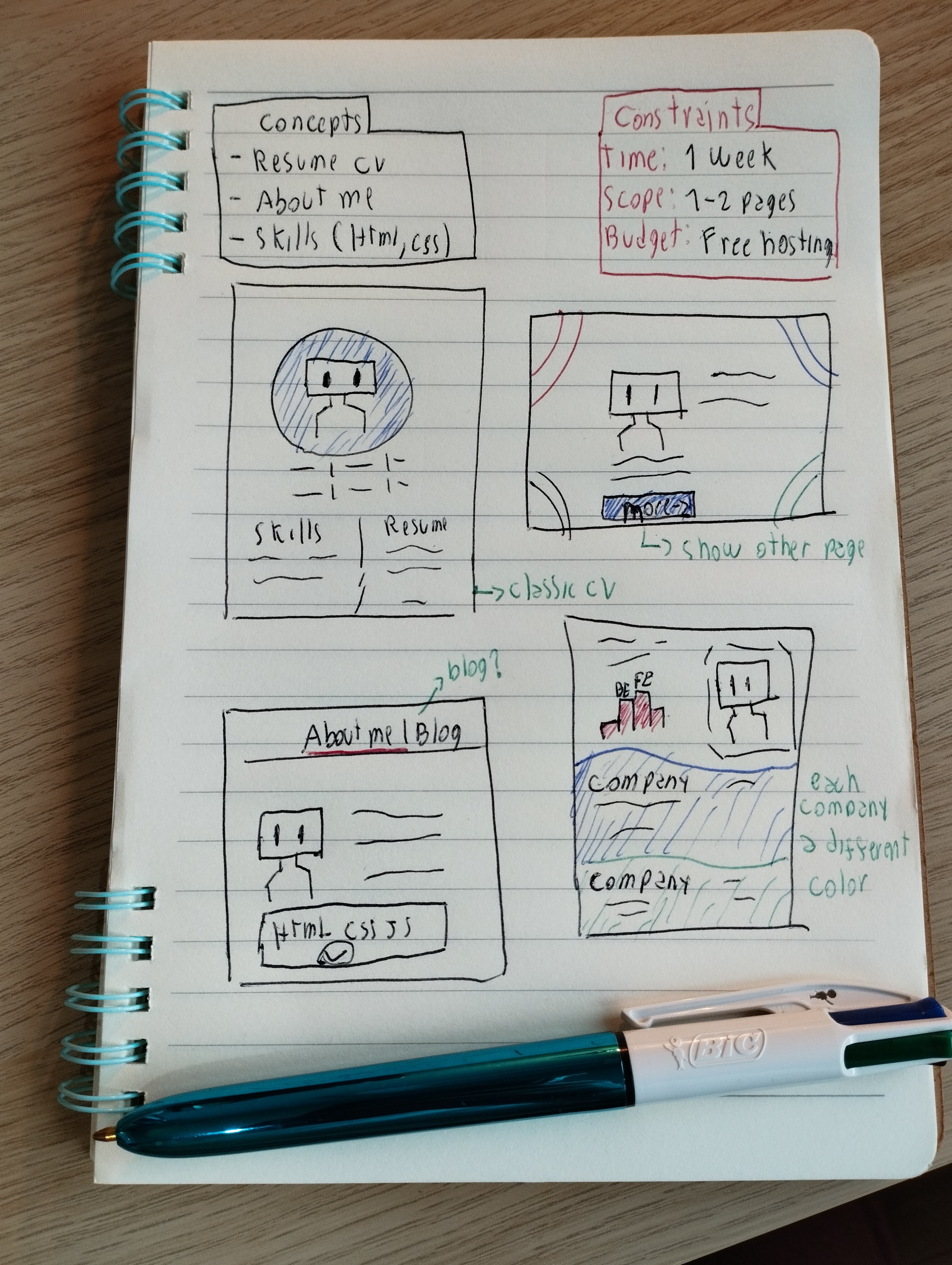 My multicolor pen and notebook
I sketched out ideas freely, allowing myself to explore without constraints. Not all ideas made it into the final project, but that’s the beauty of ideation—it’s a sandbox for exploration. At this stage, everything seems possible, and only through iteration do you discover what truly works.
Sketching on paper: It’s an excellent way to explore ideas freely, without the pressure of achieving digital perfection.
Understanding the Audience
Before moving forward, I wanted to define who my target audience would be. After all, a portfolio is only as effective as its ability to connect with its viewers. I established three key personas who might visit my site:
- HR or Recruiter: Looking for a quick overview of who I am, my experience, and whether I’d fit their hiring criteria.
- Tech Lead: Interested in the technical depth of my work—tools, techniques, and problem-solving approaches.
- Manager: Focused on results—how I’ve contributed to teams and the impact of my work.
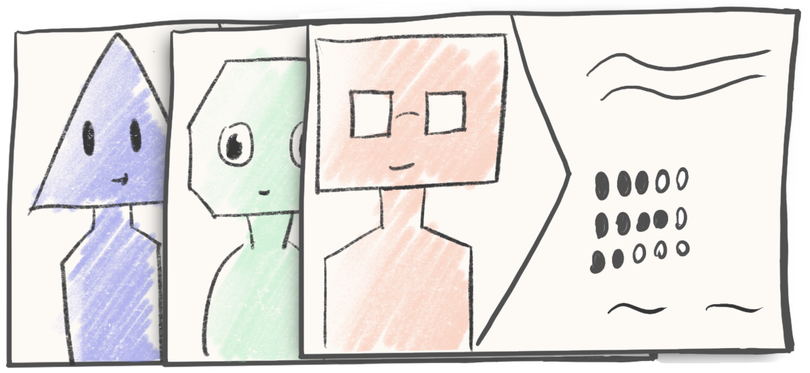 Personas sketch
Each persona would value different aspects of the portfolio, but a common thread stood out: they all needed to quickly see who I am and what I’ve accomplished. This insight shaped my approach to design and content.
The Design
With my audience in mind, I went to Figma to bring my concepts to life. The initial drafts weren’t great, but with time (and invaluable feedback from few of my designers friends) things began to click
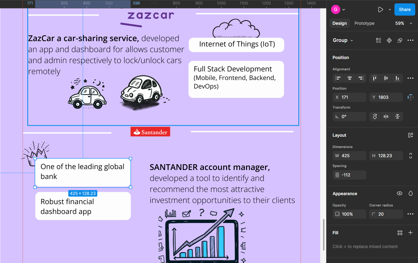 Figma Mockup
I decided to create a portfolio that functions like an enhanced CV: visually engaging, easy to navigate, and a direct showcase of my web development expertise.
Finding the right tone for the content was another challenge. I wanted to project professionalism and competence, but also to let my personality shine through. Striking this balance was key—I aimed for an approachable yet serious tone, ensuring the work speaks for itself while showing I’m someone easy to collaborate with.
I organized the page into sections that highlight the projects I’ve worked on, leaning into brutalist design elements like bold shadows and clean separations. This approach created a strong visual flow while allowing each section to align with the branding of its respective company. While different color palettes could risk making the page feel disjointed, the cohesive layout tied everything together seamlessly.
I like to think the idea or showing different colors trough my career convey with the professional I’m now, which had different experiences working diverse companies, and diverse project, with diverse stacks, smaller and large, different cultures. I bit cheesy … but I like it
Finally, I focused on the “above the fold” content—the part of the page visible without scrolling. Knowing not everyone scrolls, I made sure to highlight my key skills and include clear calls to action at the top. You’ll notice contact buttons appear twice on the page—this redundancy is intentional, ensuring visitors can take action without having to hunt for the right link.
Project Architecture
Framework
For this project, I relied on Astro. While I have a professional experience with frameworks like Angular and React, Astro was the best fit for several reasons:
- Optimized for Static Sites: Astro excels at delivering static websites with outstanding performance, making it perfect for a portfolio.
- Minimal State Management: Since my portfolio doesn’t rely on complex state handling, there was no need to use frameworks designed for managing dynamic state (e.g., React).
- Future Scalability: Despite its simplicity, Astro offers room to grow. If I decide to integrate features like a headless CMS or fetch data from the GitHub API, it provides flexibility for those additions.
- Opinionated Folder Structure: Astro’s default structure allowed me to organize my project quickly and efficiently while keeping the codebase clean.
Folder Structure
To keep the code maintainable, I worked with Astro’s suggested structure and made a few customizations. Here’s what my folder structure looks like:
📦 Project Root
 ├── 📂 public            # Static assets like images and fonts
 ├── 📂 src
 │   ├── 📂 layouts        # Reusable templates for shared components
 │   ├── 📂 pages          # Individual pages of the site
 │   ├── 📂 styles         # Shared styles and global CSS files
 │   ├── 📂 utils          # Reusable utility scripts
 │   ├── 📂 UI             # Basic reusable components
 │   └── 📂 modules        # Complex, context-specific components
- Public: Stores static assets like images and fonts.
- Layouts: Reusable templates for elements like
<head>,<body>, and other shared components across pages. Since Astro isn’t a single-page application, this was essential for consistency. - Pages: Contains individual pages of the site. These primarily organize which components to display, kept as lean and declarative as possible.
- Styles: Centralized location for shared styles and global CSS files.
- Utils: Houses reusable utility scripts. For example, I implemented a service using the
IntersectionObserverAPI to trigger animations when elements enter the viewport. - UI: A collection of sharable, basic components such as buttons and container elements with brutalist design styles.
- Modules: Sections with more complex structures are grouped into self-contained modules. This ensures these components stay together, as they are designed for specific contexts and aren’t reusable elsewhere.
CSS Library: Tailwind vs. Vanilla CSS
Choosing the right CSS approach was not a decision I made lightly. There are countless libraries available, but I focused on a few key factors to guide my choice:
- Speed: I wanted to build the portfolio quickly without compromising quality.
- Flexibility: The solution needed to accommodate the unique, quirky visual style I envisioned.
- Lightweight: I didn’t need a library bloated with pre-built components, as I preferred to craft custom elements tailored to my design.
These criteria narrowed my options to Tailwind CSS and Vanilla CSS. Here’s how I weighed the pros and cons of each:
Why Tailwind CSS?
- Lightweight and Utility-First: Tailwind doesn’t come with pre-designed UI components, but its utility classes make building a custom design system seamless. Features like predefined colors, font sizes, and spacing help ensure consistency across the interface.
- Strong Community: Tailwind has a large and active community, making it easy to find answers and resources when I encounter challenges.
- Development Speed: By keeping styles close to the HTML, Tailwind allows for faster prototyping and development, in my opinion, compared to separating styling logic in external CSS files.
- Built-In Constraints: Tailwind enforces design consistency by limiting choices (e.g., spacing and colors), reducing the chances of an inconsistent UI.
Why Consider Vanilla CSS?
- Readability: Using descriptive class names in Vanilla CSS makes code easier to understand. For example,
<div class="hotel-amenities"> ... </div>provides clear context, whereas a utility class like<div class="flex flex-row gap-4"> ... </div>requires look up in ohter parts of the code to understand what certain element is used for - Debugging Simplicity: With browser dev tools, Vanilla CSS allows quick tweaks and adjustments to entire styles in a single class. This can be faster than debugging multiple Tailwind utility classes scattered across the HTML.
- Cascading Hierarchy: Vanilla CSS leverages the cascading nature of styles, allowing you to apply rules at various levels in a predictable way. With Tailwind, I sometimes need to recall the precedence of its classes and how they override each other.
For this portfolio, I chose Tailwind CSS. Primarly for allowed me to move quickly, avoid unnecessary boilerplate, like definer margins and paddings and focus on visually cohesive design. Tailwind’s flexibility gave me a great starting point while leaving room for customization as the project grows.
Animations
Bringing Doodles to Life: Sprite Animations
If you’ve noticed the playful doodles scattered throughout my website, you might wonder why I included them. They’re more than just eye candy—they’re an intentional part of the design. These animations add a personal, welcoming touch to the site while serving as complementary visual cues. Positioned on the right side and in muted tones, they enhance the experience without stealing attention from the main content.
The process to bring these doodles to life is surprisingly simple but impactful, relying on an age-old animation trick: sprite sheets. By using a single, long image and revealing one frame at a time, I created the illusion of movement. It’s a technique that’s lightweight, efficient, and—dare I say—absolute cinema.
Why Sprite Sheets Over Individual Images?
At first glance, using one long image instead of multiple separate ones might seem like an odd choice. But there’s a lot of reasoning behind it—every decision was made with performance and usability in mind:
-
Fewer HTTP Requests
With a single sprite sheet, the browser only needs to load one image instead of making multiple requests for individual frames. This dramatically reduces loading times, especially on websites with lots of animations.
-
Smaller File Sizes
Combining frames into one image often results in a smaller overall file size. Why? Because you avoid the extra metadata and headers that each separate image would carry.
-
Reduced Latency
Every HTTP request comes with a bit of delay (latency). By using a single sprite sheet, I cut down on the number of requests, speeding up the page’s rendering process.
-
Precision Control with CS
By Far the most important perk for me it lies in CSS. By shifting the visible window (or “clip”) over the image, I can precisely control which frame is displayed at any given time. This allows for smooth animations without requiring using javascript or library
Animation enter on viewport
One of the key features of my portfolio website is the smooth animations that trigger when elements enter the viewport. As you scroll down the page, elements fade in, slide up, or grow in size, creating a dynamic and engaging experience. the way I implemented this feature is by combining a few key concepts.
First, we have the function animateEnterOnViewPort(), which creates an observer using the Intersection Observer API. This observer detects all elements with a specific data attribute (data-animate-enter) and triggers a callback when they enter the viewport. The function then uses the value of this data attribute to determine which CSS class to add to the element, applying the corresponding animation styles and bringing the magic to life.
<div data-animate-enter="animate-fade-in">Content to animate</div>
const BEFORE_ANIMATION_CLASS = 'opacity-0';
const ANIMATE_SELECTOR = '[data-animate-enter]';
const DEFAULT_THRESHOLD = 0.2;

export function animateEnterOnViewPort(): void {
 document.addEventListener('DOMContentLoaded', () => {
   const observer = createObserver(animateElements, DEFAULT_THRESHOLD);
   observeElements(observer, ANIMATE_SELECTOR);
 });
}

function createObserver(callback: IntersectionObserverCallback, threshold: number): IntersectionObserver {
 return new IntersectionObserver(callback, { threshold });
}

function observeElements(observer: IntersectionObserver, selector: string): void {
 document.querySelectorAll(selector).forEach((element) => {
   observer.observe(element);
   element.classList.add(BEFORE_ANIMATION_CLASS);
 });
}

function animateElements(entries: IntersectionObserverEntry[], observer: IntersectionObserver): void {
 entries.forEach((entry, index) => {
   if (entry.isIntersecting) {
     const target = entry.target as HTMLElement;
     const delay = getAnimationDelay(target, index);
     const animationClass = getAnimationClass(target);
     applyAnimationStyles(target, delay, animationClass);
     observer.unobserve(target);
   }
 });
}

function getAnimationDelay(element: HTMLElement, index: number): number {...}
function getAnimationClass(element: HTMLElement): string {...}
function applyAnimationStyles(element: HTMLElement, delay: number, animationClass: string): void {...}
CDN and Image Service
In this project, Cloudinary CDN is used to serve images efficiently. While storing images directly in the repository is acceptable for small projects, it can negatively impact performance in larger projects due to slower Git operations (e.g., pulls, pushes) as the repository grows. Using a CDN resolves this by offloading image storage and delivery.
Rather than hardcoding Cloudinary URLs directly in the components, an ImageService class is implemented to abstract the image retrieval logic.
import { imagesService, CdnImages} from "@utils/image-service";
const ryanairImage = imagesService.getImageUrl(CdnImages.RyanairWhite);
This class acts as a facade, allowing components to request images without worrying about the underlying CDN or image format.
The Key Benefits of this solution:
- Decouples Components: Components interact with a simple method to fetch image URLs, without needing to know where or how the images are stored.
- Easy Maintenance: If the CDN provider changes, or if the image delivery method needs optimization (e.g., new formats, different providers), the component code remains unchanged, as long as the method signatures are preserved.
- Scalability: New images can be added by updating the enum, without modifying component logic.
// enumnto facilate the usage and readability, and guarates that only images listed can be used
export enum CdnImages {
  Profile = 'profile-with-lines_rq7n47',
  McDonalds = 'Mcdonalds_fdpxuq',
  Ryanair = 'ryanair_cm3wsa',
...
}

class ImagesService {
  private cloudInstance;

  constructor(cloudName: string) {
    this.cloudInstance = new Cloudinary({
      cloud: {
        cloudName
      }
    });
  }

  public getImageUrl(imageName: CdnImages, resizeWidth?: number, format: string = 'webp'): string {
    const image = this.cloudInstance.image(imageName);

    if (resizeWidth) {
      image.resize(fill().width(resizeWidth))
    }
    return image.format(format).toURL();
  }

}

//export constant rather than a class to create singleton,
//and doesn't need insatiate the communication with Cloudinary api all the time
export const imagesService = new ImagesService('...');
Eye Tracking
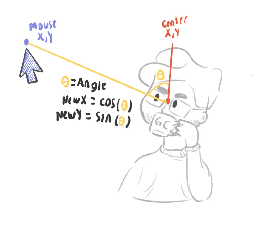
One of the most subtle yet engaging features of my website is the eye movement animation on my avatar. It’s a simple yet effective touch that gives the site a bit of personality, and it also demonstrates some interesting concepts in JavaScript development. Let me walk you through the code behind this feature and the thought process.
 MATH TIME
export default class MouseTracker {
  constructor(private element: HTMLElement) {
    this.init();
  }

  private init() {
    document.addEventListener("mousemove", this.trackMouseMovement.bind(this));
  }

  private trackMouseMovement(event: MouseEvent) {
    const { centerX, centerY } = this.calculateElementCenter();
    const { mouseX, mouseY } = this.getMousePosition(event);
    const angleRadians = this.calculateAngleBetweenPoints(centerX, centerY, mouseX, mouseY);
    const { newPositionX, newPositionY } = this.calculateNewPosition(angleRadians);
    this.translateElement(newPositionX, newPositionY);
  }

  private calculateElementCenter() {
    const elementRect = this.element.getBoundingClientRect();
    const centerX = elementRect.left + elementRect.width / 2;
    const centerY = elementRect.top + elementRect.height / 2;

    return { centerX, centerY };
  }

  private getMousePosition(event: MouseEvent) {
    return { mouseX: event.clientX, mouseY: event.clientY };
  }

  private calculateAngleBetweenPoints(x1: number, y1: number, x2: number, y2: number) {
    const dX = x2 - x1;
    const dY = y2 - y1;
    return Math.atan2(dY, dX);
  }

  private calculateNewPosition(angleRadians: number, distanceFactor = 5) {
    const newPositionX = Math.cos(angleRadians) * distanceFactor;
    const newPositionY = Math.sin(angleRadians) * distanceFactor;

    return { newPositionX, newPositionY };
  }

  private translateElement(x: number, y: number) {
    this.element.style.transform = `translate(${x}px, ${y}px)`;
  }
}

document.addEventListener("DOMContentLoaded", () => {
  const eyesElement = document.getElementById("eyes");
  if (eyesElement) {
    new MouseTracker(eyesElement);
  }
});
The Role of trackMouseMovement: The Orchestrator
At the heart of the animation lies the trackMouseMovement method. It acts as the orchestrator, coordinating all the key steps needed to bring the animation to life. Here’s what it does every time the mouse moves:
-
Finds the Element’s Center
The method calculates the center of the element (the “eyes” in this case) by measuring its bounding rectangle and computing its midpoint. This ensures the movement is always relative to the eye’s exact position.
-
Gets the Mouse Position
Using the
MouseEventobject, it retrieves the current mouse position (mouseX,mouseY), creating a connection between the user’s input and the animation. -
Calculates the Angle
The angle between the eye center and the mouse position is determined using trigonometry. This allows the eye to track the cursor direction precisely.
-
Generates New Coordinates
With the angle calculated, the method determines how far the eye should move by computing new X and Y offsets based on a distance factor.
-
Applies the Movement
Finally, it updates the eye’s position using a CSS transform, creating a smooth and responsive animation.
This modular, step-by-step orchestration not only keeps the code clean and maintainable but also ensures the animation is snappy and accurate.
How the Angle is Calculated
The movement direction is determined by the angle between two points: the element’s center and the mouse position. Let’s break this down:
-
Difference in Coordinates:
The horizontal (
dX) and vertical (dY) differences are calculated:const dX = mouseX - centerX; const dY = mouseY - centerY; -
Calculating the Angle (Radians):
Using
Math.atan2, the angle between the two points is determined in radians. The method considers both the horizontal and vertical distances, making it perfect for scenarios like these where direction matters.const angleRadians = Math.atan2(dY, dX); -
calculateNewPositionOnce the angle is known, the element’s movement is calculated with trigonometry:
const newPositionX = Math.cos(angleRadians) * distanceFactor;
const newPositionY = Math.sin(angleRadians) * distanceFactor;
Here,
Math.cosandMath.sindetermine how far the element moves along the X and Y axes, respectively, based on the angle and adistanceFactor. The distace factor is constant of how far it moves from the center it could be dynamic , but it would require a more complex change considering the boundaries so the eyes does not move out of the desired area, so for simplicity it’s a static value. -
CSS Transform for Smooth Transitions
The final step applies the calculated position using
transform:this.element.style.transform = `translate(${x}px, ${y}px)`;
By relying on CSS transforms, it avoids browser trigger reflow and layout recalculations, making it more efficient.
Final Thoughts
This project was more than just a technical exercise; it was a reflection of my journey as a web developer. It allowed me to experiment with technologies like Astro and Cloudinary, while also exploring my creativity through animations. It was interesting and fun to bring my ideas to life and see them come together in an engaging portfolio/resume—I haven’t decided what to call it yet.
Thank you for taking the time to explore my website, and feel free to reach out.